RM9 Color Picker Changed & Color Coding Sets Added
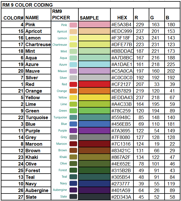
Versions prior to RM9 have but one set of color codes; RM9 added 9 more sets for a total of 10, any one of which can be active. Each color in each set and each set can be uniquely labelled to make it easier to understand what the colors mean; the labels appear in the Tool Tip when the cursor is hovered over a color block in some of the main views. The RM9 colors, color names and database color numbers are identical to those of RM8.
Databases migrated from prior versions will have their one color coding set preserved in RM9’s “Color code set 1” which is the column named “Color” in PersonTable. “Color code set 2” is confusingly stored in the PersonTable.Color1 column… and “Color code set 10” in column “Color9”.
The color picker has changed from the grid of RM8 to a list, due probably to the enhancement to custom label each color. Unfortunately, that undermines the perception of color families presented by the RM8 grid and potential color selection strategies based on the grid as discussed below. The labels, however, likely outweigh those considerations.

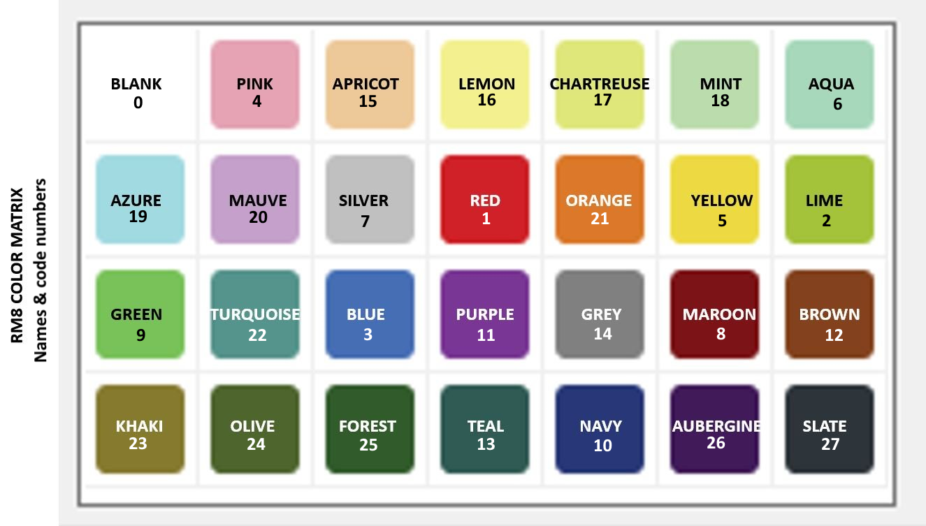
RM8 Color Picker Chart with Names & Codes
 Colors available in RootsMagic 8 color coding, labelled with names and database code numbers.
The above chart is an adaptation of a file posted by Lynn Christiansen to facebook Dec 31, 2021. He took a screenshot of the RM8 Color Coding window color picker and labelled each patch with the name. I’ve added the Color Number to each corresponding to the value the program assigns to the Color field for a row in the PersonTable.
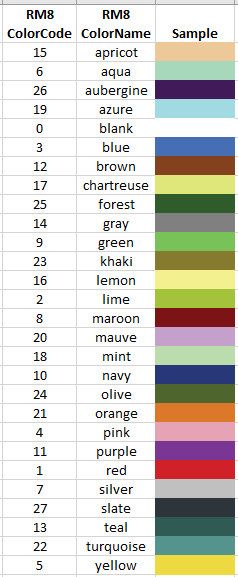
RM8 Colors Sorted by Name and Code
The following table images provide ready lookup of color samples by the Color Code number used in the RM8 database and by the label in the RM8 Color Coding color picker.
RM8 Color ‘Families’
Starting with the diagonality of the RM8 Color Picker chart for the gray colours (Blank or no colour, Silver, Grey, Slate) there appears to be more or less parallel diagonalities which we might call colour families, naming them by the highest member on the chart. For example, the Mauve family comprises also Purple and Aubergine; the Aqua family includes Azure, Blue, and Navy. In the following overlay of the Color Picker, each member of a family is framed by the colour of the uppermost member and has a line connecting its centre with the other members. Hope that’s clear!
 Families of RM8 Colors
RM8 Color Selection Strategies
How colours will appear in isolation or in juxtaposition with other colours can be tricky. Whether it is text or filled cell or both that is coloured is another variable. Saturation and brightness contrasts are factors to consider, especially for text on a white background and especially when printed in grayscale.
Text
The following images are from a screen capture of a PDF saved from the RM8 Individual List report. The database contains only ‘people’ with the names of the colours from the RM8 Color Picker in their Surname and the database color number for the Given. The RIN corresponds with the color number except for Color 0 (Blank fill or Black text) which is RIN 28. The grayscale image was derived by a conversion of the colour screenshot to “black & white” in Paint.net.
Avoid most of the top two rows in the RM8 Colour Picker for coloured text on white or light backgrounds; Blank (black text) and Red are good.
Fill
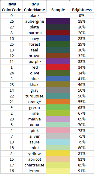
The following two images are from a screen capture of an Excel spreadsheet which computes the approximate brightness of a color’s RGB values using the formula:
brightness = (red / 255.0) * 0.3 + (green / 255.0) * 0.59 + (blue / 255.0) * 0.11
Perceived brightness will vary with monitor, printer and viewer and, in the case of conversion to grayscale, the conversion software. The grayscale image was converted from the colour image by Paint.net’s “black & white” Adjustment tool which may calculate brightness with a different algorithm. If you perceive some colour’s grayscale to be out of order, it may be due to any one or any combination of these variables.
 RM8 Color Codes by approx brightness
 RM8 Color Codes by brightness – grayscale
Juxtapositions
- because some adjacent colors in the picker are hard to distinguish (e.g., Lemon-Chartreuse; Mint-Aqua; Maroon-Brown; Olive-Forest-Teal) do not follow a horizontal pattern through the Color-Picker for adjacent generations. However, it might work for a couple…
- the diagonals (down 1, right 2 like a knight’s move in chess) shown through each colour family could work well for juxtaposed colours
- the opposing diagonal would contrast well (e.g., Aqua-Orange-Blue-Khaki) (down 1, left 2)
- diagonals of -45 degrees or down-right are a bit weak around Chartreuse-Yellow and Lime-Green; diagonals of -135 degrees or down-left avoid those issues
- vertical trails through the colour picker seem to be distinctive, e.g., start at the top of a column, working down to the bottom and then to the top of the next column.
Migration of RM4-7 Color Codes to RM8
RM8 expanded the number of color selections to 28 (codes 0-27) from 15 (codes 0-14) in earlier versions. RM7 databases imported into RM8 retain their original color code numbers but the expanded range results in some name changes and color shifts in order to accommodate the extra colors. For example, Fuschia (4) is no more and is replaced by Pink. The following table compares the colors from RM7 with those in RM8 having the same code number. Note that the switch from coloring text in RM7 to a colored block in RM8 certainly necessitated that code 0 change from black to blank (or no color).
 RM7 colors and the RM8 colors having the same code number.


